Guidelines
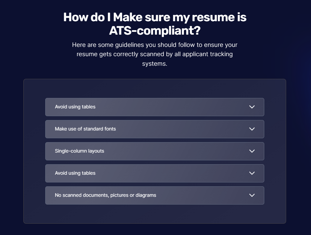
The Guidelines section provides some guidelines that a user can follow to ensure that their resume gets correctly scanned by all applicant tracking systems.
The section can be broken down into the following divisions:
Guidelines accordion
We followed these steps to make the same:
We used TypeScript declaration to initialize a constant variable named
accordionswith a value of anarrayof objects. Each object in thearrayrepresents a guideline and has two properties:titleanddata.The
Guidelines[]type suggests thataccordionsis anarraycontaining objects that adhere to the structure defined by the Guidelines type.guidelines.tsxconst accordions: Guidelines[] =[
{
title:"Avoid using tables",
data : "Label your work experience and education sections with conventional section titles"
},
{
<!--Other guidelines' title and data-->
},
];
Similar steps were carried out to add title and data of other guidelines.
We used a JavaScript expression to map over the
accordions array. For each object in thearray, it returned a JSX element representing anaccordionitem.accordion.jsx{
accordions.map(({ title, data, open }) => (The
openattribute is set based on theopenproperty of the current item in theaccordions array.The class attribute defines the CSS classes for styling the
accordionitem, and the style attribute sets inline styles for the background gradient.accordion.jsx<details open={open} class="border-box rounded-md p-1 group border border-[#667085]" style="background: linear-gradient(116.05deg, rgba(255, 255, 255, 0.25) 21.76%, rgba(255, 255, 255, 0.0875) 119.92%);">We used a JSX element to represent the heading part of the
accordionitem and used the<summary>HTML tag to define the heading.{title}was used to insert thetitleproperty of the current accordion item within the heading and{data}was used to insert thedataproperty.JavaScript expression was used to insert an
<img>element within the heading for thedown arrow.The class attribute defines CSS classes for styling the image, including a
group-open:rotate-180class that applies a rotation transform when theaccordionitem is open.accordion.jsx<summary class="flex items-center justify-between text-white p-3 px-6 text-sm">
{title}
{<img src="../GuidelinesSection/Icon.svg" alt="Down arrow" class="h-4 w-4 group-open:rotate-180 "/>}
</summary>
<div class="p-4">
<p class="text-white box-content font-inter text-sm ">
{data}
</p>
</div>
</details>
))
Guidelines accordian:


Header and Intro
We followed these steps to make the same:
- We used a
divelement with class names which contains the content displayed within the section. <p>element was used to define text styling and display the header text "How do I Make sure my resume is ATS-compliant?".- Another
<p>element was used to display additional text providing the intro.
<div class="text-white text-center">
      <p class="text-2xl sm:text-4xl font-rubik tracking-tight font-semibold">How do I Make sure my resume is <br>ATS-compliant?
        </p>
        <p class="text-md sm:text-lg font-light mt-2">Here are some guidelines you should follow to ensure your <br> resume gets correctly scanned by all applicant tracking<br> systems.</p>
    </div>
Header and Intro:

We made use of a section element with multiple class names and a style attribute to set the padding, background image, and background color for the section.
After combining all of the divisions, the Guidelines section can be seen like this:
Guidelines section:

The Guidelines section has been executed successfully! Let's see how we created the ATS Resume template section of the Resume Screener Website.