Header
The Header section is an informative element which is present at the top of every page of the website. With its navigational features, it facilitates easy access to each and every page of the Training and Placement Website. It consists of TCET Logo, Thakur Educational Group Logo, Title & Description and a Menu presenting a list of links to different pages. Hence providing essential information and contributing to user-friendly experience.
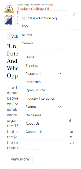
Mobile Navigation Menu
In order to create a menu for smaller screens for TNP website, we need to create a react functional component "MobileNav" which will display collapsible section.
Here's how we did it:
Opening the "MobileNav.tsx" file.
Inside the component, two props are defined primaryLinks and secondaryLinks which correspond to the primary and secondary links respectively.
MobileNav.tsxconst MobileNav: React.FC<{
primaryLinks: link[];
secondaryLinks: link[];
}navOpenis a state variable used to indicate whether the menu is opened or closed. TheuseOnClickOutsidehook is used to detect clicks outside the menu and closes the menu accordingly.MobileNav.tsxconst [navOpen, setNavOpen] = useState(false);
const ref = useRef(null);
const ref2 = useRef(null);
useOnClickOutside(ref, () => setNavOpen(false), ref2);The
MobileNavcomponent returns the navigational menu. The<button>element inside the<div>serves as a switch to open and close the menu. TheonClick()event handler changes the value ofnavOpenwhenever the button is clicked.MobileNav.tsx<div className="relative" >
<button
data-collapse-toggle="mobile-menu-2"
type="button"
// Styling
onClick={() => setNavOpen(!navOpen)}
>
</div>The button displays an
svgicon that is defined according to the condition whether the value ofnavOpenis "true" or "false".MobileNav.tsx// Other sections of code
{!navOpen ? ( // when the navOpen is set to false
<svg
xmlns="http://www.w3.org/2000/svg"
fill="none"
viewBox="0 0 24 24"
strokeWidth={1.5}
stroke="currentColor"
className="w-6 h-6"
>
<path
strokeLinecap="round"
strokeLinejoin="round"
d="M3.75 6.75h16.5M3.75 12h16.5m-16.5 5.25h16.5"
/>
</svg>
):(<svg
//defines the <svg> component when the menu is open
>
<path
//...
>
</svg>)}After the
<button>element,<aside>displays the menu whennavOpenvariable is set totrue. It contains two<nav>elements, one for the primary links section. This section also links to thakureducation.org. It maps overprimaryLinksarray to display each link as an anchor element.MobileNav.tsx{primaryLinks.map((p) => (
<a
key={p.title}
href={p.link}
className=" text-sm w-full text-slate-900 hover:underline"
>
{p.title}
</a>
))}tipIn the same way, the secondary
<nav>is used to displaysecondaryLinks. If a link hassubLinks, an Accordian component is rendered for each sublink.Save the file.
Run
yarn devto see the changes in your local environment.
Main Menu on smaller screens will look like this:

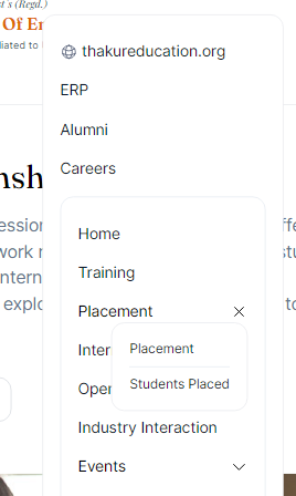
Accordian Component
A collapsible menu is created for sublinks of Placement and Events using react functional component called "Accordian". We created this collapsible menu in following ways:
Open the "Accordian.tsx" file.
The "Accordian" component contains a
<span>element which serves as a container for the accordian item. It contains<p>element to display the title of the sublink and an<svg>element which is responsible for displaying an arrow pointing downwards whenisOnis set tofalseand a cross whenisOnis set totrue.Accordian.tsx{!isOn ? ( //when isOn is set to false
<svg
xmlns="http://www.w3.org/2000/svg"
fill="none"
viewBox="0 0 24 24"
strokeWidth={1.5}
stroke="currentColor"
className="w-4 h-4 lg:w-4 lg:h-4 cursor-pointer"
>
<path
strokeLinecap="round"
strokeLinejoin="round"
d="M19.5 8.25l-7.5 7.5-7.5-7.5"
/>
</svg>
) : (
<svg
// defined when isOn is set to true
>
<path
//...
/>
</svg>
)}When the
isOnis set totrue, it renders a<span>element which maps over links inlinksarray and displays each link as an anchor element.Accordian.tsx{links.map((l) => (
<a
href={l.link}
className=" text-xs xl:text-sm text-slate-900 hover:underline border-b border-slate-200 pb-2 last:border-0 last:pb-0 w-full"
>
{l.title}
</a>
))}The
Accordianelement also handles mouse events. When the mouse hovers over the menu, theisOnis set totruewhich opens the collapsible section. When the mouse is out of the accordian menu, theisOnis set tofalsewhich closes the section.Accordian.tsxonMouseOver={() => {
// console.log("mouse over");
setIsOn(true);
}}Save your progress.
Run
yarn devto see the changes in your local system.
The Accordian Component looks like this:

Primary links and Secondary links
The links for ERP, Alumni and Careers are defined in the
primaryLinksarray of typelink[]in "index.astro" file. To add links for Alumni and Career pages, create objects in the following way with "title" and "link" properties:index.astroconst primaryLinks: link[] = [
{
title: "ERP",
link: "http://erp.tcetmumbai.in/",
},
// Other links
]tipIn the same way
secondaryLinksarray is created with "title" and "link" properties. This array lists links of various pages of the TNP website. Some links also havesublinks. The sublinks have the same properties assecondaryLinksobjects. To add sublinks, create link objects in the following way:index.astroconst secondaryLinks: link[] = [
{
title: "Placement",
link: "/placement",
subLinks: [
{
title: "Placement",
link: "/placement",
},
],
},
// Other links and sublinks
]
Displaying Navigational Menu
To display the main menu, we executed the follwing steps:
A
<div>element in the<header>of "index.astro" file is created where thesecondaryLinksarray is iterated. Inside the<span>element, it checks if there are any sub-links. In case of no sub-links, it displays the anchor tag<a>with the link and title of the item. If there are sub-links, it renders an<Accordian>component.index.astro<div class="hidden lg:flex text-slate-800 justify-evenly py-2 border-b">
{
secondaryLinks.map((s) => (
<span class="flex items-center gap-2">
{!s.subLinks && <a class="text-xs xl:text-sm hover:underline" href={s.subLinks?"":s.link}>
{s.title}
</a>}
{s.subLinks && <Accordian title={s.title} client:load links={s.subLinks} />}
</span>
))
}
</div>
The primary links are listed in the same container where the site's logo and title are placed. Refer the index.astro file.
Displaying Logo
Open
index.astrofile.TNP logo is displayed in the extreme left of the header. Within the
<div>element of<header>, anchor tags are used. This is how it was executed:index.astro<div class="space-y-2 md:flex md:mr-4">
<a href="/">
<img
src="/Images/TCET Logo.png"
class="object-contain w-14 lg:w-24"
alt="TCET Logo"
/>
</a>
</div>infoSimilar steps were carried out for displaying Thakur Education Group logo for smaller screens.
To see how we added title and description on the header, refer index.astro file from the TNP Website repository.
After adding Logo, creating Menu and adding Title & Description, the header section can be seen like this:

The Header Section is succesfully executed! Let's move on and see how we created the Hero Section of the TNP Website.